Thursday 4 March 2021

Roving

Are you sending a robotic rover to Mars? Do you require software to characterize and calibrate the cameras on your rover? Then you should consider using MTF Mapper, just like the Mars 2020 Perseverance Mastcam-Z team did! [1] 


ps: Of course, MTF Mapper also works on earthbound cameras of all shapes and sizes.


References

1. Hayes, A.G., Corlies, P., Tate, C. et al. Pre-Flight Calibration of the Mars 2020 Rover Mastcam Zoom (Mastcam-Z) Multispectral, Stereoscopic Imager. Space Sci Rev, 217, 29 (2021). 
 

Sunday 12 July 2020

Lateral Chromatic Aberration measurements now available in MTF Mapper

The article title rather ruins the surprise, but MTF Mapper now supports the measurement of Chromatic Aberration (CA). For now, the emphasis is on the measurement of lateral CA, and in this post I will demonstrate the accuracy of MTF Mapper's implementation, and I will also provide some usage examples.

Before we jump in, I'd just like to point out that I now accept donations to support the development of MTF Mapper through PayPal:

It goes without saying that MTF Mapper remains free and Open Source. There is no obligation to send me money if you use MTF Mapper, and I will continue to add new features to MTF Mapper regardless.

Ok, back to the topic. This post is quite long, so you can skip ahead to the part that interests you if you like. First, I have a review of the concept of lateral chromatic aberration, so you can skip over this to an explanation of how lateral CA is measured in MTF Mapper. Or you can skip to the MTF Mapper CA measurement accuracy experiments and results. Lastly, you can go straight to the usage example if you want to see how to use this, and what the output looks like.

Edge orientation convention

In order to fully explain lateral CA measurement as implemented in MTF Mapper, it is necessary to agree on some convention to describe the orientation of an edge. In this context, "edge" refers to the edge of a trapezoidal slanted-edge target. A radial edge falls along a line passing through the centre of the lens, as seen from the front of the lens. The midpoint of a tangential edge is tangent to a circle concentric with the optical axis of the lens.

Fig 1: Edge orientation convention
Although these definitions are strict, we will allow for some deviation from the exact radial and tangential orientations in practice when performing measurements.

Longitudinal Chromatic aberration

Longitudinal Chromatic Aberration (LoCA) appears when a lens does not focus light with different wavelengths at the same focus plane. For example, blue light might be focused slightly in front of the sensor at the same time that green light is perfectly focused on the sensor.

Fig 2: Illustration of longitudinal CA


If you are capturing an image of a crisp step edge (like we often see in slanted-edge MTF measurements), then the image of the edge in the blue wavelengths still lines up perfectly with the image of the edge in the green wavelengths, it might just be slightly softer because it is out of focus. As you might imagine, LoCA does not necessarily have any preferential direction, i.e., edges in a tangential orientation could be affected by LoCA in exactly the same way as edges with a radial orientation. Of course, things are never quite this simple, so tangential and radial LoCA might be different if your lens suffers from severe astigmatism. Fig 3 gives you some idea of what longitudinal CA could look like in practice.

Fig 3: Example of simulated longitudinal CA

For another excellent discussion of CA, including a demonstration of how MTF50 varies with focus position between the three colour channels, you should head over to Jack Hogan's article on the topic, and I should mention that Jack used Jim Kasson's data in places.

Lateral Chromatic aberration

Lateral Chromatic Aberration simply means that the image magnification is dependent on the wavelength. In other words, we might have a lens that can keep blue, green and red wavelengths all concurrently in focus at the sensor (where "in focus" means focus is within some tolerance), but the blue wavelengths are projected with a magnification of 0.99 relative to the green wavelengths, and the red wavelengths with a magnification of 1.01, for example.

Fig 4: Illustration of lateral CA


Returning to our slanted-edge target, which we can pretend is located near the edge of the image with a tangential orientation, we will see that the red, green and blue channels have comparable sharpness, but that the edge in the blue channel appears to be shifted inwards towards the centre of the image, and the red channel edge appears to be shifted outwards, relative to the green edge. Keep in mind that this is just one example of how the magnification varies by wavelength, and that other combinations are possible, e.g., both red and blue could have sub-unity magnification. Fig 5 presents a simulated example of lateral CA:

Fig 5: Example of simulated lateral CA


So what about radially oriented edges? Well, because the wavelength-depended magnification is radial, we tend to not see any red or blue channel shift at all on radial edges. You could still see some longitudinal CA on those edges, though.


How do you measure CA

Well, I do not know how other people measure it, but MTF Mapper uses the Line Spread Function (LSF) of slanted-edge targets to measure the apparent shift between the red-green and green-blue channel pairs. This means that I first extract an Edge Spread Function (ESF) for each channel, using the tried-and-tested code in MTF Mapper that already compensates for geometric lens distortion. Taking the derivative of the ESF yields the LSF, and the weighted centroid of the LSF is a fairly good estimate of the sub-pixel location of the edge. Rinse and repeat for all three colour channels, and you can estimate CA by subtracting the green channel centroid from the red and blue channel centroids.

I suppose there are many other ways to implement this, really any method that is typically used to perform dense image co-registration will work. Personally, I have played with some Fourier cross-correlation methods [1], as well as a really cool method [2] that estimates the least-squares optimal FIR filter (convolution filter, if you want to sound more hip) to reconstruct the moving image from the fixed image, e.g., estimating the red channel from the green channel, in the CA application case. The centroid of this FIR filter will give you an accurate estimate of the sub-pixel shift. Anyhow, these methods are fine, but there are some advantages to the LSF-based method. The first two that come to mind is that the LSF-based method is not affected by lens distortion, and that you can apply it directly to a Bayer-mosaiced image without requiring a demosaicing algorithm. Just like MTF/SFR measurements, if you are interested in measuring the lens properties, then capturing a raw image and processing the Bayer-mosaiced image directly is the way to go.
Note that the LSF-centroid method I described above can be applied to any edge orientation that is suitable for slanted-edge measurements, so more-or-less anything but integer multiples of 45°. I started out measuring the CA on all edges, but I eventually decided to discard the measurements obtained from radial edges (more precisely, edges that are within 45 degrees of being radially oriented), mostly because I did not know what I was measuring. You can get around this MTF Mapper restriction at the moment by cropping out a single slanted edge, and using the --single-roi MTF Mapper option, which will measure CA regardless of the radial / tangential nature of the edge.

Experimental set-up

To test the accuracy of MTF Mapper's CA measurement functionality, I generated synthetic images with simulated CA. The following three aspects could affect the measurements:
  1. The magnitude of the shift between the colour channels. Just to make sure that we can detect both subtle and severe CA.
  2. The apparent sharpness of the edge, since a softer simulated lens yields an image with a more blurry edges. Intuitively, a more blurry edge make the exact location of the edge less well defined, which should increase the uncertainty in the CA measurement.
  3. Simulated noise, using a realistic sensor noise model (FPN, read noise and photon shot noise), but with a tunable overall SNR. Again, one would expect higher noise levels to increase the uncertainty of the CA measurement.

Some combinations of the above dimensions will now be investigated.

Results: blur vs. noise at a fixed shift, full density RGB

Although one would expect the absolute shift between, say, the red and the green channels to increase as a function of radial distance, with worse lateral CA at the edge of the image, this does not make the best candidate for low-level accuracy evaluation. My first set of experiments simulated a constant radial shift of 1 pixel between the red and the green channels across the entire simulated image (and a -1 shift for blue). This yields 322 usable radial edge measurements from one simulated "lensgrid" chart image, with most edges ending up with a length between 100 and 120 pixels (this is relevant when discussing the impact of noise). This is what the synthetic image looks like, if you are curious:


The simulated system was similar to my usual diffraction + square photosite with a simulated aperture of f/4, and a photosite pitch of 4.73 micron. This time, however, I further employed the "-p wavefront-box" option to simulate varying degrees of defocus, sweeping the W020 term from through to 3.5λ. Such a range of simulated defocus yields images with MTF50 values in the range 0.47 to 0.05 cycles per pixel, covering the range you are likely to encounter in actual use.

Fig 6: 95th percentile shift error (pixels), full density RGB input images

In Fig 6 we can see the 95th percentile of the absolute error in the measured shift, relative to the expected shift, as we vary the edge sharpness and the noise level. To put things in perspective, keep in mind that an SNR of 10 is quite poor, and that you should be able to achieve an SNR of 100 with a printed paper test chart without too much effort. Of course, one has to keep in mind that vignetting can be a problem in the image corners: an SNR of 100 in the image centre with about 3.3 stops of vignetting will result in an SNR of 10 in the image corners. Anyhow, this is what the MTF50=0.05, SNR=5 case, with red shifted +1 pixels, and blue shifted -1 pixels looks like:

Fig 7: An example of what a 1-pixel lateral shift in the red and blue channels looks like under MTF50=0.05 with SNR=5 conditions


As I will demonstrate later, the measured CA shift values are completely unbiased. Here I show the 95th percentile of the error, but the mean value in each cell (over all 322 edges) deviates less than 0.013 pixels from the expected value in all cells, including the worst-case combination of blur and noise. One minor detail remains, though: the results in Fig 6 were obtained with full density RGB input images, meaning the simulation generated individual R, G and B values at each pixel, so this is representative of a Foveon-like sensor, not a typical Bayer CFA sensor.

Results: blur vs. noise at a fixed shift, Bayer-mosaiced

A more representative example would be to reduce the full-density RGB image to a Bayer-mosaiced image, and then processing the resulting image as using MTF Mapper's "--bayer green" input option. This will cause the CA measurements to be performed using the mosaiced data; note that the "--bayer green" option will still cause MTF Mapper to use the appropriate red and green Bayer subsets for CA measurements, and that only the MTF data will be extracted using only the green Bayer subset. Since the number of samples along each edge is reduce by the Bayer mosaicing, we expect an increase in the CA measurement error.

Fig 8: 95th percentile shift error (pixels), Bayer mosaic input images

Comparing Fig 8 to Fig 6 reveals that we now require better SNR values to maintain the same level of accuracy in the CA shift measurements. For example, the SNR=40 column in Fig 8 is a reasonable match for the SNR=20 column in Fig 6. Ok, perhaps Bayer-mosaiced SNR=40 is slightly better than full-RGB SNR=20, but you get the idea.

Results: blur vs. noise at a fixed shift, Bayer demosaiced

What happens if we take the Bayer-mosaiced images generated in the previous step, and we run them through a demosaicing algorithm to produce another full-density RGB image? I chose to use OpenCV's built-in demosaicing algorithm, COLOR_BayerRG2BGR_EA. This may not be the best demosaicing algorithm on the planet, but it produced output that was consistent.

Fig 9: 95th percentile shift error (pixels), demosaiced input images

Comparing Fig 9 to Fig 8 delivers a few surprises: At the SNR=100 and SNR=50 noise levels, the demosaiced image produced slightly more accurate results around the MTF50=0.24 scenario rather than at the sharpest setting (MTF50=0.47), and the demosaiced image actually performed slightly better than the raw Bayer-mosaiced case in the high-blur, low-SNR corner.

In retrospect, it makes sense that the demosaiced CA measurement is less accurate on very sharp edges, because aliasing is likely to make demosaicing harder, or less accurate, perhaps. The other surprise is perhaps also not so unexpected, since demosaicing is an interpolation process, thus we expect it to filter out high-frequency noise to some extent. In the lower-right corner of our table we encounter scenarios where there is little high-frequency content to the edge location (the edge is blurry, after all), but we have a lot of noise, so some additional low-pass filtering courtesy of the demosaicing interpolation helps just enough. Perhaps this is an indication that MTF Mapper could benefit from applying additional smoothing during low-SNR CA measurements in future.

Results: shift vs. noise at a fixed blur, Bayer-mosaiced

Note that I will now skip over the full-density RGB results for brevity, and move right along to raw Bayer-mosaiced results obtained at different simulated lateral CA shifts. The expectation is that the shift measurement accuracy should be independent of the actual shift magnitude within the usable measurement range, which is probably around ±20 pixels. Only two noise levels were investigated, SNR=50 and SNR=10, representing the good-but-not-perfect, and need-to-improve-lighting scenarios.

Fig 10: Difference between measured CA shift and expected CA shift, low noise scenario, raw mosaiced image

Fig 11: Difference between measured CA shift and expected CA shift, high noise scenario, raw mosaiced image

The boxplots not only give us an indication of the spread of the CA shift measurements, but also hint at the smallest difference in shift that can be discerned. As shown in Fig 10, MTF Mapper can easily measure differences in CA shift of well below 0.1 pixels under good SNR conditions, but Fig 11 shows that there is some overlap between adjacent shift steps under very noisy conditions. By overlap I mean that adjacent boxes are separated by an expected difference of 0.1 pixels in CA shift, but we can see that the height of the whiskers of the boxes in Fig 11 exceeds 0.1 pixels. Another reassuring feature is that we can see that all the boxes are centred nicely around an error of zero, thus the measurements are unbiased.

Results: shift vs. noise at a fixed blur, Bayer demosaiced

Similar to the previous experiment, but with an additional demosaicing step, again using OpenCV's algorithm. I will only show the noisy case for brevity:
Fig 12: Difference between measured CA shift and expected CA shift, high noise scenario, OpenCV demosaiced image

If you compare Figs 11 and 12, you might notice that the spread of the differences is slightly smaller in Fig 12, i.e., just like we observed in Fig 9 we are seeing a small noise reduction benefit with demosaicing, but without adding any bias to the measurement. Well, that is with OpenCV's demosaicing algorithm. I also repreated the experiment using LibRaw's open_bayer() function, but I suspect that I am doing something wrong, because I get some pronounced zippering artifacts, and this boxplot:

Fig 13: Difference between measured CA shift and expected CA shift, low noise scenario, LibRaw AHD demosaic image

Unlike all the other scenarios, the LibRaw AHD experiment yields CA shift measurements that have a very obvious bias, seen as the systematic deviation from a zero-mean error in Fig 13. I am not going to say much more here, because it is most likely user error on my part.

Recommendations following the experiments

Several aspects that affect the accuracy of lateral CA measurements were considered above, including the magnitude of the shift between channels, the overall sharpness of the edge, and the prevailing signal-to-noise conditions. It is hard to make any recommendation without choosing some arbitrary threshold of when a CA measurement is considered "accurate enough". My rule of thumb in these matters is that an accuracy of 0.1 pixels is a reasonable target, since this figure often appears in machine vision literature. Given this target, we can break down the results above to produce the following recommendations:
  1. The easiest parameter to control, and the one you should probably put the most effort into controlling, is the signal-to-noise ratio. If your images look like Fig 7 above, you simply cannot expect accurate results. If you can keep the SNR at 30 or higher, you can expect to hit the target accuracy of 0.1 pixels.
  2. The next parameter you should try to control is focus. CA measurements on well-focused images are more accurate than those obtained from blurry photos. Having said that, some lenses are just not very sharp, and if you have extreme field curvature your image corners are bound to be out of focus. One recommendation here is to capture two shots: one with the "optimal" focus (whatever your criteria for that are), and another obtained after focusing in one of the image corners. This two-photo strategy is really only necessary in extreme cases when you face blurry corners and extreme vignetting, or you could not control the SNR because of external factors.
  3. Do not measure CA on demosaiced images if you can help it. For Fuji X-trans you have no choice with MTF Mapper at the moment, but for any Bayer CFA layout you should use raw images when possible. At some point, I will look at other demosaicing algorithms, maybe even LightRoom, just to see what is possible.

User interface and visualization

CA measurements are now available through the MTF Mapper GUI. If you are new to MTF Mapper, you can view the user guide after installation (e.g., using this link to install the Windows 10 binaries) under the help menu in the GUI, or you can download a PDF version from this link if you want to browse through the guide first before you decide to install MTF Mapper.

Fig 14: Preferences dialogue

As shown in Fig 14, MTF Mapper now has a new output type (a), as well as an option to control which type of visualization to generate (b). The CA measurement is visualized either as the actual shift in pixels (or microns, if you set the pixel size and select the "lp/mm units" option), measured in the red/blue channels, or the shift can be expressed as a percentage of the radial distance from the measurement to the centre of the image. I processed some images of my Sigma 10-20 mm lens on a Nikon D7000 to illustrate:
Fig 15: lateral CA map, with shift indicated in pixels

Fig 16: same lateral CA map, but this time the shift is expressed as a fraction of the radial distance

Personally, I prefer the visualization in Fig 15, but I have noticed that other software suites offer the visualization in Fig 16; normalizing the lateral CA shift by the radial distance should help to make the measurement less dependent on the final print size, I suppose. The main problem with the way that I have implemented this method (Fig 16) is that there is an asymptote at the centre of the lens where the radial distance is very small. This rather ruins the scaling of the plot; I think Imatest works around this problem by suppressing the central 30% of the plot. I should probably do something similar, but suggestions are welcome.

Here is a crop of a target trapezoid from the top-left corner of the image, with a measured red channel shift of -0.4 (i.e, red is smaller than green), and a measured blue channel shift of -1.06 on the upper left edge, which gives it the green tinge we see in Fig 17. The opposite edge sports a magenta tinge, as we would expect.

Fig 17: Crop of a target from the top-left corner of the chart image used to produce Figs 15 and 16. Please excuse the sad condition of the test chart I used here :)

For my usage patterns, I think it would be very helpful to be able to select a specific edge, and have MTF Mapper display the lateral CA measurement for that edge. My plan is to add the CA measurement to the info display what goes with the MTF/SFR curve plot that pops up when you click on an edge in the Annotated image output. In the meantime, both the smoothed, gridded data and the raw measurements are made available for your enjoyment.

If you are a command-line user, you can enable CA measurement with the "--ca" flag. The raw CA measurements are available in a self-documenting file called "chromatic_aberration.txt" in the output directory, but you also get the plot as "ca_image.png". Note that GUI users can now also get their hands on both these files by using the "Save all results" button on the main GUI window after completing a run.

Lastly, I should emphasize that it is important to achieve good alignment between the sensor and the test chart for CA measurements. I think that there might be some tilt in my results shown in Figs 15 and 16 above. Or perhaps lateral CA is not supposed to be perfectly symmetric; come to think of it, I suppose it would be affected by tilted lens elements, for example. At any rate, you can use MTF Mapper's built-in Chart Orientation output mode to help you refine your chart alignment.

Conclusion

You can try out the latest version of MTF Mapper yourself to play with the new features. I have released Windows binaries of version 0.7.29, and I will probably release some Ubuntu .debs as well soon. Or you can build from source :)

In future, I plan on doing some comparisons with other related tools, probably Imatest and QuickMTF, to see how well they perform on my synthetic images. And I hope to understand the problems I have run into with certain demosaicing algorithms, although I still think that lateral CA measurements should be performed on raw images whenever possible.

References

  1. Almonacid-Caballer, Jaime, Josep E. Pardo-Pascual, and Luis A. Ruiz. "Evaluating Fourier cross-correlation sub-pixel registration in Landsat images." Remote Sensing 9, no. 10 (2017): 1051.
  2. Gilman, Andrew, Leist, Arno, "Global Illumination-Invariant Fast Sub-Pixel Image Registration." The Eighth International Multi-Conference on Computing in the Global Information Technology (ICCGI), Nice, France, (2013):95-100.


Thursday 29 August 2019

Aliasing and the slanted-edge method: what you have to know

Aliasing, as it pertains to the digital sampling of signals, is a tricky subject to discuss, even amongst people who have a background in signal processing. It is not entirely unlike the notion that the speed of light in a vacuum represents an absolute upper speed limit to everything in the universe as we understand it. Once people accept the speed of light as an absolute limit, they often have trouble accepting subtle variations on the theme, like how Cerenkov radiation is caused by particles moving through a medium at a speed exceeding the speed of light in that same medium.

Similarly, I have found that once people embrace the Shannon-Nyquist sampling theorem and its consequent implications, they are reluctant to accept new information that superficially appears to violate the theorem. In this post I hope to explain how the slanted-edge method works, in particular the way that it only appears to violate the Shannon-Nyquist theorem, but really does not. I also circle back to the issue of critical angles discussed in an earlier post, but this time I show the interaction between aliasing and edge orientation angle.

What were we trying to do anyway?

I will assume that you would like to measure the Modulation Transfer Function (MTF) of your optical system, and that you have your reasons.

To obtain the MTF, we first obtain an estimate of the Point Spread Function (PSF); the Fourier Transform of the PSF is the Optical Transfer Function (OTF), and the modulus of the OTF is the MTF we are after. But what is the PSF? Well, the PSF is the impulse response of our optical system, i.e., if you were to capture the image of a point light source, such as a distant star, then the image of your star as represented in your captured image will be a discretely sampled version of the PSF. For an aberration-free in-focus lens + sensor system at a relatively large aperture setting, the bulk of the non-zero part of the PSF will be concentrated in an area roughly the size of a single photosite; this should immediately raise a red flag if you are familiar with sampling theory.

Nyquist-Shannon sampling theory tells us that if our input signal has zero energy at frequencies of F Hertz and higher, then we can represent the input signal exactly using a series of samples spaced 1/(2F) seconds apart. We can translate this phrasing to the image domain by thinking in terms of spatial frequencies, i.e, using cycles per pixel rather than cycles per second (Hertz). Or you could use cycles per millimetre, but it will become clear later that cycles per pixel is a very convenient unit.

If we look at an image captured by a digital image sensor, we can think of the image as a 2D grid of samples with the samples spaced 1 pixel apart in both the x and y dimensions, i.e., the image represents a sampled signal with a spacing of one sample per pixel. I really do mean that the image represents a grid of dimensionless point-sampled values; do not think of the individual pixels as little squares that tile neatly to form a gap-free 2D surface. The fact that the actual photosites on the sensor are not points, but that the actively sensing part of each photosite (its aperture) does approximately look like a little square on some sensors, is accounted for in a different way: rather think of it as lumping the effect of this non-pointlike photosite aperture with the spatial effects of the lens. In other words, the system PSF is the convolution of the photosite aperture PSF and the lens PSF, and we are merely sampling this system PSF when we capture an image. This way of thinking about it makes it clear that the image sampling process can be modeled as a "pure" point-sampling process, exactly like the way it is interpreted in the Nyquist-Shannon theory.

With that out of the way, we can get back to the sampling theorem. Recall that the theorem requires the energy of the input signal to be zero above frequency F. If we are sampling at a rate of 1 sample per pixel, then our so-called Nyquist frequency will be F = 0.5 cycles per pixel. Think of an image in which the pixel columns alternate between white and black --- one such pair of white/black columns is one cycle.

So how do we know if our signal power is zero at frequencies above 0.5 cycles per pixel? We just look at the system MTF to see if the contrast is non-zero above 0.5 cycles per pixel. Note that the system MTF is the combination (product) of the lens MTF, and the photosite aperture MTF. If our photosites are modelled as 100% fill-factor squares, then the photosite aperture MTF is just |sinc(f)|, and if we model an ideal lens that is perfectly focused, then the lens MTF is just the diffraction MTF. I have simulated some examples of such a system using a photosite pitch of 5 micron, light at 550 nm, and apertures of f/4 and f/16, illustrated in Fig 1.

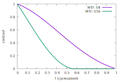
Fig 1: Simulated system MTF curves, ideal lens and sensor
We can see that the f/16 curve in Fig 1 is pretty close to meeting that criterion of zero contrast above 0.5 cycles/pixel, whereas the f/4 curve represents a system that is definitely not compliant with the requirements of the sampling theorem, with abundant contrast after 0.5 cycles/pixel.

Interestingly enough, the Nyquist-Shannon sampling theorem does not tell us what will happen if the input signal does not meet the requirement. So what does actually happen? Aliasing, and potentially lots of it. The effect of aliasing can be illustrated in the frequency domain: energy at frequencies above Nyquist will be "folded back" onto the frequencies below Nyquist. But aliasing does not necessarily destroy information; it could just make it hard to tell whether the energy we see at frequency f (for f < Nyquist) should be attributed to the actual frequency f, or whether it is an alias for energy at a higher frequency of 2*Nyquist - f, for example. The conditions under which we can successfully distinguish between aliased and non-aliased frequencies are quite rare, so for most practical purposes we would rather avoid aliasing if we can.

A subtle but important concept is that even though our image sensor is sampling at a rate of 1 sample per pixel, and therefore we expect aliasing because of non-zero contrast at frequencies above 0.5 cycles per pixel, it does not mean that the information at higher frequencies has already been completely "lost" at the instant the image was sampled. The key to understanding this is to realize that aliasing does not take effect at the time of sampling our signal: aliasing only comes into play when we start to reconstruct the original continuous signal, or if we want to process the data in a way that implies some form of reconstruction, e.g., computing an FFT. A trivial example might illustrate this argument: Consider that we have two analogue to digital converters (ADCs) simultaneously sampling an audio signal at a sample rate of 4 kHz each. If we offset the timing of the second ADC with half the sampling period (i.e., 1/8000 s) relative to the first ADC, then we have two separate sets of samples each with a Nyquist limit of 2 kHz. If we combine the two sets of samples, we find that they interleave nicely to give us an effective sampling period of only 1/8000 s, so that the combined set of samples now has a higher Nyquist limit of 4 kHz. Note that sampling at 4 kHz did not harm the samples from the individual ADCs in any way; we can combine multiple lower-rate samples at a later stage (under the right conditions) to synthesize a higher-rate set of samples without contradicting the Nyquist-Shannon sampling theorem. The theorem does not require all the samples to be captured in a single pass by a single sampler. This dual ADC example illustrates the notion that the Nyquist limit does not affect the capture of the samples themselves, but rather comes into play with the subsequent reconstruction of a continuous signal from the samples.

Normally, this subtle distinction is not useful, but if we are dealing with a strictly cyclical signal, then it allows us to combine samples from different cycles of the input signal as if they were sampled from a single cycle. An excellent discussion of this phenomenon can be found in this article, specifically the sections titled "Nyquist and Signal Content" and "Nyquist and Repetitive Signals". That article explains how we can sample the 60 Hz US power line signal with a sample rate of only 19 Hz, but only because of the cyclic nature of the input signal. This technique produces a smaller effective sample spacing, which is accomplished by re-ordering the 19 Hz samples, captured over multiple 60 Hz cycles, to reconstruct a single cycle of the 60 Hz signal. The smaller effective sample spacing obtained in this way is sufficiently small, according to the Nyquist-Shannon theorem, to adequately sample the 60 Hz signal.

We can design a similar technique to artificially boost the sampling rate of a 2D image. First, imagine that we captured an image of a perfectly vertical knife-edge target, like this:


A perfectly vertical knife-edge image, magnified 4x here

We can plot the intensity profile of the first row of pixels, as a function of column number, like this:
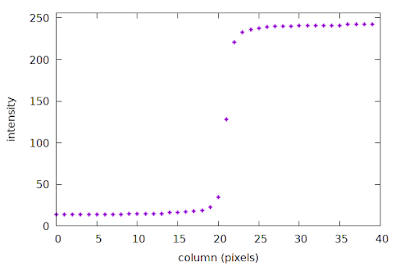
An example of a discretely sampled ESF
This plot is a sparse discrete sample of the Edge Spread Function (ESF), with a spacing of one sample per pixel. In particular, note how sparse the samples appear around columns 20-22, right at the edge transition where the high-frequency content lives. The slanted-edge method constructs the ESF as an intermediate step towards calculating the system MTF; more details are provided in the next section below. The important concept here is that the first row of our image is a sparse sample of the ESF.

But what about the next row in this image? It is essentially another set of samples across the edge, i.e., another set of ESF samples. In fact, if we assume that the region of interest (ROI) represented by the image above is small enough, we can pretend that the system MTF is constant across the entire ROI, i.e., the second row is simply another "cycle" of our cyclical signal. Could we also employ the "spread your low-rate samples across multiple cycles" technique, described above in the context of power line signals? Well, the problem is that our samples are rigidly spaced on a fixed 2D grid, thus it is impossible to offset the samples in the second row of the image, relative to the first, which is required for that technique. What if we moved the signal in the second row, rather than moving the sampling locations?

This is exactly what happens if we tilt our knife-edge target slightly, like this:
A slanted knife-edge image, magnified 4x
Now we can see that the location of the edge transition in the second row is slightly offset from that of the first row; if we plot the sparse ESFs of the first two rows we can just see the small shift:
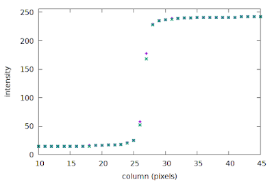
Sparse ESFs of rows 1 and 0 of the slanted edge image
Since only the relative movement between our sample locations and the signal matters, we can re-align the samples relative to the edge transition in each row to fix the signal phase, which effectively causes our sample locations to shift a little with each successive image row.
This approach creates the conditions under which we can use a low sampling rate to build a synthetic set of samples, constructed over multiple cycles, with a much smaller effective sample spacing. The details of how to implement this are covered in the next two sections.

To recap: the slanted-edge method takes a set of 2D image samples, and reduces it to a set of more closely spaced samples in one dimension (the ESF), effectively increasing the sampling rate. There are some limitations, though: some angles thwart our strategy, and we will end up with some unrecoverable aliasing. To explain this phenomenon, I will first have to explain some implementation details of the slanted-edge method.

The slanted-edge method

I do not want to describe all aspects of the slanted-edge method in great detail in this post, but very briefly, the major steps are:
  1. Identify and model the step edge in the Region Of Interest (ROI);
  2. Construct the irregularly-spaced oversampled Edge Spread Function (ESF) with the help of the edge model;
  3. Construct a regularly-spaced ESF from the irregularly-spaced ESF;
  4. Take the derivative of the ESF to obtain the Line Spread Function (LSF);
  5. Compute the FFT of the LSF to obtain the Modulation Transfer Function (MTF);
  6. Apply any corrections to the MTF (derivative correction, kernel correction if necessary).
Today I will focus on steps 2 & 3.

Constructing the ESF

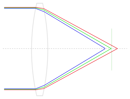
We construct an oversampled Edge Spread Function (ESF) by exploiting the knowledge we have of the existing structure in the image, as illustrated in Fig 1.
Fig 2: The slanted-edge method, following Khom's description
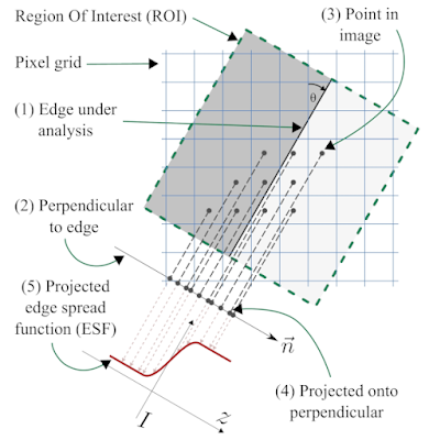
We start with a region of interest (ROI) that is defined as a rectangular region of the image aligned with the edge orientation, as shown in Fig 2. We use the orientation of the edge-under-analysis (1) to estimate θ, the edge angle, which is used to construct a unit vector that is normal (perpendicular) to the edge (2), called n. Now we take the (x, y) coordinates of the centre of each pixel (3), and project them onto the normal vector n (4) to obtain for each pixel i its signed distance to the edge, represented by di. The intensity of pixel i is denoted Ii, and we form a tuple (di, Ii) to represent the projection of pixel i onto the normal n. If we process all the pixels i inside the ROI, we obtain the set of tuples ESFirregular = {(di, Ii)}, our dense-but-irregularly spaced ESF (5).

We can see quite clearly in Fig 2 that even though the original 2D pixel centres have a strict spacing of one sample per pixel-pitch, the projection onto the normal vector n produces a set of 1D samples with a much finer spacing. Consider a concrete example with θ = 7.125°, producing a line slope of 1/8 with respect to the vertical axis, as illustrated in Fig 2; this means the vector n can be written as (-1, 8)/√(-12 + 82), or n = (-1, 8)/√65. If we take an arbitrary pixel p = (x, y), we can project it onto the normal n by first subtracting the coordinates of a point c that falls exactly on the edge, using the well-know formula involving the vector dot product to yield the scalar signed-distance-from-edge d such that
d = (p - c) · n.
If we substitute our concrete value of n and expand this formula, we end up with the expression d = (8y - x)/√65 + C, where C = c · n is simply a scalar offset that depends on exactly where we chose to put c on the edge. If we let k = 8y - x, where both x and y are integers (we can choose our coordinate frame to accomplish this), then d = k/√65 + C, or after rearranging, d - C = k/√65.
This implies that d - C is an integer multiple of 1/√65 ≈ 0.12403, meaning that the gaps between consecutive di values in ESFirregular must be approximately 0.12403 times the pixel pitch. We have thus transformed our 2D image samples with a spacing of 1 pixel pitch into 1D samples with a spacing of 0.12403 times the pixel pitch, to achieve roughly 8× oversampling.

The spacing of our oversampled ESF can indeed support a higher sampling rate, e.g. 8× as shown in the previous paragraph. This means that the Nyquist limit of our 8× oversampled ESF is now 4 cycles/pixel, compared to the original 0.5 cycles/pixel of the sampled 2D image, effectively allowing us to reliably measure the system MTF at frequencies between 0.5 cycles/pixel and 1.0 cycles/pixel (and higher!), provided of course that our original system MTF had zero energy at frequencies above 4 cycles/pixel. For typical optical systems, this 4 cycles/pixel limit is much more realistic compared assuming zero contrast above the sensor Nyquist limit of 0.5 cycles/pixel.

The argument presented here to show how the slanted-edge projection yields a more densely-spaced ESF holds for most, but not all, angles θ in the range [0, 45]. We typically take the irregularly spaced ESFirregular and construct from it a regularly spaced ESF at a convenient oversampling factor such as 8× so that we can apply the FFT algorithm at a later stage (recall that the FFT expect a regular sample spacing). The simplest approach to producing such a regular spacing is to simply bin the values in ESFirregular into bins with a width of 0.125 times the pixel pitch; we can then analyse this binning to determine which specific angles cause problems.

Revisiting the critical angles

Above I have shown that you can attain 8× oversampling at an edge orientation angle of θ = 7.1255°. But what about other angles? In a previous blog post I attempted to enumerate the problematic angles, but I could not come up with a foolproof way to list them all. Instead, we can follow the empirical approach taken by Masaoka, and simply step through the range 0° to 45° in small increments. At each angle we can attempt to bin the irregular ESF into an 8× oversampled regular ESF. For some angles, such as 45°, we already know that consecutive di will be exactly 1/√2 ≈ 0.70711 times the pixel pitch apart, leaving most of the 8× oversampling bins empty. The impact of this is that the effective oversampling factor will be less than 8.

How can we estimate the effective oversampling factor at a given edge orientation angle? To keep things simple, we will just look at di values in the range [0, 1) since we expect this to be representative of all intervals of length 1 (near the edge --- at the extremes of the ROI samples will be more sparse). We divide this interval into 8 equal bins of 0.125 pixels wide, and we take all the samples of ESFirregular such that 0 ≤ di < 1, and bin them while keeping track which of the 8 bins received samples, which I'll call the non-empty bins. The position of the edge relative to the origin of our pixel grid (what Masaoka called the "edge phase") will influence which of the 8 bins receive samples when we are simulating certain critical angles. For example, at an edge angle of 45° and an edge phase of zero we could expect two non-empty bins, since the consecutive di values might be (0, 0.70711, 1.4142, ...). If we had an edge phase of 0.5, then we would have only one non-empty bin because the consecutive di values might be (0.5, 1.2071, 1.9142, ...). A reasonable solution is to sweep the edge phase through the range [0, 1) in small increments, say 1000 steps, while building a histogram of the number of non-empty bins. We can then calculate the mean effective oversampling factor (= mean number of non-empty bins) directly from this histogram, which is shown in Fig 3:
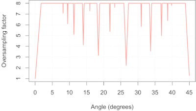
Fig 3: Mean effective oversampling factor as a function of edge orientation
This simulation was performed with a simulated edge length of 30 pixels, so Fig 3 is somewhat of a worst-case scenario. We can readily identify the critical angles I discussed in the previous post on this topic: 45, 26.565, 18.435, 14.036, 11.310,  9.462, and  8.130. We can also see a whole bunch I previously missed, including 30.964, 33.690, 36.870, and 38.660. In addition helping us spot critical angles, Fig 3 also allows us to estimate their severity: near 45° we can only expect 1× oversampling, near 26.565° we can only expect 2× oversampling, and so on.

What can we do with this information? Well, if we know our system MTF is zero above 0.5 cycles/pixel, then we can actually use the slanted-edge method safely on a 45° slanted edge, as I will show below. Similarly, using an edge at an angle near 26.565° is only a problem if our system MTF is non-zero above 1 cycle/pixel. Alternatively, we could decide that we require a minimum oversampling factor of 4×, thus allowing us to measure system MTFs with cut-off frequencies up to 2 cycles/pixel, and use Fig 3 to screen out edge angles that could lead to aliasing, such as 0°, 18.435°, 33.690°, 26.565° and 45°.

What aliasing looks like when using the slanted-edge method

This post is already a bit longer than I intended, but at the very least I must give you some visual examples of what aliasing looks like. Of course, to even be able to process edges at some of the critical angles requires a slanted-edge implementation that deals with the issue of empty bins, or perhaps an implementation that adapts the sampling rate to the edge orientation. MTF Mapper, and particularly the newer "loess" mode introduced in 0.7.16, does not bat an eye when you feed it a 45° edge.

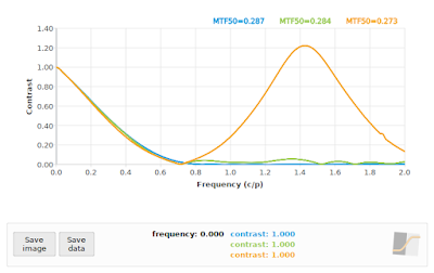
A 45° edge angle will give us di values with a relative spacing in multiples of √0.5, so our effective sampling rate is approximately 0.70711 samples per pixel pitch, giving us a sampling frequency of 1/√0.5 ≈ 1.4142, with a resulting Nyquist frequency of 0.70711. But first I will show you the SFR of three simulated systems at f/4, f/11 and f/16 under ideal conditions (perfect focus, diffraction only, no image noise) at a simulated edge angle of 5° so that you can see approximately what we expect the output to look like:
Fig 4: Reference SFR curves at 5°. Blue=f/4, Green=f/11, Orange=f/16
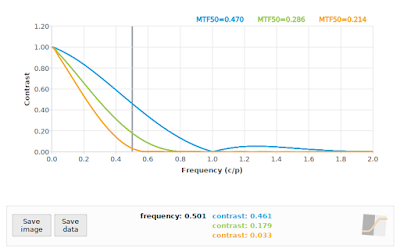
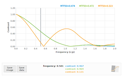
Fig 4 is the baseline, or what we would expect if our sampling rate was high enough. Note that the f/4 curve in particular has a lot of non-zero contrast above 0.70711 cycles/pixel, so we should be prepared for some aliasing at critical angles. If we process the 45° case with the default MTF Mapper algorithm (or "kernel" in version 0.7.16 and later) then we obtain Fig 5. This is rather more exciting that we hoped for.

Fig 5: MTF Mapper "kernel" SFR curves at 45°. Blue=f/4, Green=f/11, Orange=f/16
In particular, notice the sharp "bounce" in the blue f/4 curve at about 0.71 cycles/pixel, our expected Nyquist frequency; this is very typical aliasing behaviour. Also notice the roughly symmetrical behaviour around Nyquist. Normally we do not expect to see a sharp bounce at 0.71 cycles/pixel on a camera without an OLPF (my simulation is without one), however, we do often see a bounce at 0.68 cycles/pixel for the apparently common OLFP "strength", which makes it a little bit tricky to tell the two apart. The best way to eliminate the OLPF as the cause of the bounce is to check another slanted-edge measurement at 5°. Can we do something about those impressively high contrast values (> 1.2) near 1.41 cycles/pixel? Well, MTF Mapper has does have a second ESF construction algorithm (
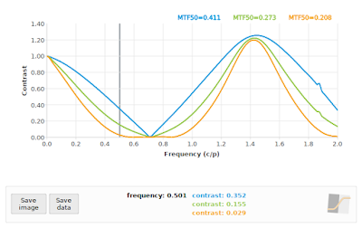
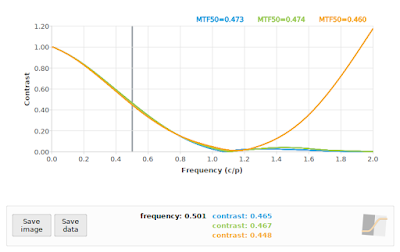
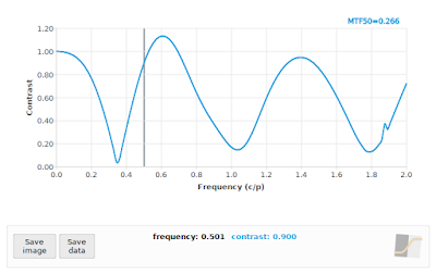
announced here): the "loess" option, which gives us the SFR curves see in Fig 6.
Fig 6: MTF Mapper "loess" SFR curves at 45°. Blue=f/4, Green=f/11, Orange=f/16
We can see that the output of the "loess" algorithm does not have a huge bump around 1.41 cycles/pixel, which is much closer to the expected output shown in Fig 4. It does, however, make it much harder to identify the effects of aliasing. It is tempting to try and directly compare the 45° case to the 5° case (Fig 4), but we have to acknowledge that the system MTF is anisotropic (see one of my earlier posts on anisotropy, or Jack Hogan's detailed description of our sensor model, including the anisotropic square pixel apertures), meaning that the analytical system MTF at a 45° angle is not identical to that at 5° angle owing to the square photosite aperture. I will rather use a nearby angle of 40°, thus comparing the 45° results to the 40° results at each aperture in Figures 7 through 9.

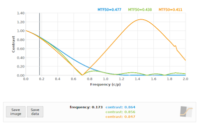
Fig 7: f/4: Comparing "loess" algorithm at 45° (green), and "kernel" algorithm at 45° (orange)  to reference 40° (blue)
Fig 8: f/11: Comparing "loess" algorithm at 45° (green), and "kernel" algorithm at 45° (orange)  to reference 40° (blue)
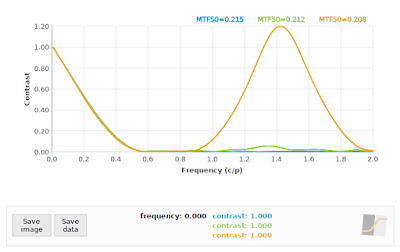
Fig 9: f/16: Comparing "loess" algorithm at 45° (green), and "kernel" algorithm at 45° (orange)  to reference 40° (blue)


In all cases, the "loess" algorithm produced more accurate results, although we can see that neither the "loess" or the "kernel" algorithms performed well on the f/4 case. This is to be expected: the effective sampling rate at a 45° edge angle pegs the Nyquist frequency at 0.70711 cycles/pixel, and we know that our input signal has significant contrast above that frequency (as shown again in the blue curve in Fig 7). On the other hand, both algorithms performed acceptably on the f/16 simulation (if we ignore the "kernel" results above 1.0 cycles/pixel), which supports the claim that if our system MTF has zero contrast above the effective Nyquist frequency (0.70711 cycles/pixel in this case), then a 45° edge angle should not present us with any difficulties in applying the slanted-edge method.

Does this mean that we should allow 45° edge angles? Well, they will not break MTF Mapper, and they can produce accurate enough results if our system is bandlimited (zero contrast above 0.71 c/p), but I would still avoid them; it is just not worth the risk of aliasing. As such, the MTF Mapper test charts will steer clear of 45° edge angles.

What about our second-worst critical angle at 26.565°? A quick comparison at f/4 using the "loess" algorithm vs a 22° edge angle is shown in Fig 10.
Fig 10: f/4: Comparing "loess" algorithm at 26.565° (green), and "kernel" algorithm at 26.565° (orange)  to reference 22° (blue)
We can see in Fig 10 that the "loess" algorithm at 26.565° (green) is pretty close to the reference at 22° (blue), but the "kernel" algorithm does its usual thing in the face of aliasing, and adds another bump at twice the Nyquist frequency. So far so good at 26.565° angles, right?

Unfortunately the story does not end here. Recall that MTF Mapper has the ability to use a subset of the Bayer channels to perform a per-channel MTF analysis. We can pretend that the grayscale images we have been using so far is a Bayer mosaic image, and process only the green and red subsets, as shown in Fig 11.
Fig 11: f/4: Comparing "loess" algorithm at 26.565° using only the Green Bayer channel (green), and the "loess" algorithm at 26.565° using only the Red Bayer channel (orange) to the "loess" algorithm on the grayscale image at 26.565° as reference (blue)
Whoops! Even though the "loess" algorithm performed adequately at 26.565° using a grayscale image, and almost the same when using only the Green Bayer channel, it completely falls apart when we apply it to only the Red Bayer channel. This is not entirely unexpected, since we are only using 1/4 of the pixels to represent the Red Bayer channel, and these samples are effectively spaced out at 2 times the photosite pitch in the original image. The resulting projection onto the edge normal still  decreases the sample spacing like it normally does, but our effective oversampling factor is now only 0.5 * √5   ≈ 1.118, which drops the Nyquist frequency down to 0.559 cycles/pixel, as can be seen from the bounce the orange curve in Fig 11. You can see that the "loess" algorithm is struggling to suppress the aliased peak at 1.118 cycles/pixel.

If you really want to see the wheels come off, you can process a 45° angled edge using only the Red Bayer subset, as shown in Fig 12. As a general rule, the SFR/MTF curve should decrease with increasing frequency. There are exceptions to this rule: 1) we know that if the impact of diffraction is relatively low, such as with an f/4 aperture on a 5 micron photosite pitch sensor, then we expect the curve to bounce back after 1 cycle/pixel owing to the photosite aperture MTF, and 2) when we are dealing with a severely defocused MTF we can expect multiple bounces. Incidentally, these bounces are actually phase inversions, but that is a topic for another day. Even in these exceptional cases, we expect a generally decreasing envelope to the curve, so if you see something like Fig 12, you should know that something is amiss.
Fig 12: MTF Mapper "loess" algorithm applied to a simulated f/4 aperture image, with an edge orientation of 45° while limiting the analysis to only the Red Bayer channel. In case you are just reading this caption and skipping over the text, when you see an SFR curve like this, you should be worried.
As long-term MTF Mapper user Jack Hogan pointed out, the SFR curves above do look rather scary, and some reassurance might be necessary here. It is important to realize that only a handful of edge orientation angles will produce such scary SFR curves; if you stick to angles near 5° you should always be safe. Sticking to small angles (around 4° to 6°) also avoids issues with the anisotropy induced by the square photosite aperture, but if we stick to those angles then we cannot orient our slanted-edge to align with the sagittal/meridional directions of the lens near the corners of our sensor. As long as you are aware of the impact of the anisotropy, you can use almost any edge orientation angle you want, but navigate using Fig 3 above to avoid the worst of the critical angles.

Wrapping up

We have looked closely at how the ESF is constructed in the slanted-edge method, and how this effectively reduces the sample spacing to allow us to reliably measure the SFR at frequencies well beyond the Nyquist rate of 0.5 cycles/pixel implied by the photosite pitch. Unfortunately there are a handful of critical angles that have poor geometry, leading to a much lower than expected effective oversampling factor. At these critical angles, the slanted-edge method will still alias badly if the system MTF has non-zero contrast above the Nyquist frequency specific to that critical angle.

If you are absolutely certain that your system MTF has a sufficiently low cut-off frequency, such as when using large f-numbers or very small pixels, then you can safely use any edge orientation above about 1.7°. I would strongly suggest, though, that you rather stick to the range (1.73, 43.84) degrees, excluding the range (26.362, 26.773) degrees to avoid the second-worst critical angle. It would also be prudent to pad out these bounds a little to allow for a slight misalignment of your test chart / object.

I guess it is also important to point out that for general purpose imaging, your effective sample spacing will remain at 1 sample per pixel, and aliasing will set in whenever your system MTF has non-zero contrast above 0.5 cycles/pixel. The slanted-edge method can be used to measure your system MTF to check if aliasing is likely to be significant, but it will not help you to avoid or reduce aliasing in photos of subjects other than slanted-edge targets.

Lastly, this article demonstrated the real advantage of using the newer "loess" algorithm that has been added to MTF Mapper. The new algorithm is much better at handling aliased or near-aliased scenarios, without giving up any accuracy on the general non-aliased scenarios.

Acknowledgements

I would like to thank DP Review's forum members, specifically Jack Hogan and JACS, for providing valuable feedback on earlier drafts of this post.

Wednesday 3 July 2019

Journal paper on MTF Mapper's robust edge-spread function construction algorithms now available

A new paper on MTF Mapper's robust edge-spread function (ESF) construction algorithms has been published in the Optical Society of America's JOSA A journal. The paper provides an analysis of the impact of the slanted-edge orientation angle on the uniformity (or lack thereof) of the distribution of the samples used to construct the ESF; this is essentially the evolution of the notion of critical angles first described in this blog post. Next, the paper describes two different methods that can be used to construct an ESF to minimize the impact of the non-uniformity of the samples, with some results to demonstrate the efficacy of the proposed methods.

The full citation for this paper is:
F. van den Bergh, "Robust edge-spread function construction methods to counter poor sample spacing uniformity in the slanted-edge method," Journal of the Optical Society of America A, Vol. 36, Issue 7, pp. 1126-1136, 2019.

You can see the abstract of the paywalled article here. Or you can go and take a look on SourceForge, where you can find pre-press versions of my MTF Mapper related papers.

I am particularly fond of the LOESS-based algorithm, which is available in MTF Mapper version 0.7.16 and later (on SourceForge now). The LOESS-based algorithm performs better than the current implementation at higher frequencies, with less bias in the MTF curve above 0.5 cycles per pixel. This does not result in a huge improvement in the accuracy of MTF50 values; for practical use the main advantage of the LOESS-based algorithm is that it is able to produce more consistent results regardless of the slanted edge orientation angle. As an example of the improvement you can expect with the LOESS-based algorithm, the following figure illustrates the difference between the legacy ESF model (now called "kernel" in the preferences), and the LOESS ESF model (called "loess" in the preferences):
The error between the expected analytical SFR and the legacy ESF model (black curve), compared to the error obtained with the LOESS model (red curve), as measured on a simulated slanted edge. The legacy ESF model tends to overestimate contrast at high frequencies; the LOESS ESF model no longer does this. Note the scale of the y-axis!


Initially, I plan on making the use of the new algorithm optional (0.7.16 still defaults to "kernel"), but I hope to make the LOESS-based algorithm the default in versions 0.8.0 and later, after it has endured some more real-world testing. Any feedback will be appreciated!


Thursday 23 August 2018

Simulating defocus and spherical aberration in mtf_generate_rectangle

It has been many years since I last tinkered with the core functionality of mtf_generate_rectangle. For the uninitiated, mtf_generate_rectangle is a tool in the MTF Mapper package that is used to generate synthetic images with a known Point Spread Function (PSF). The tool can generate black rectangular targets on a white background for use with MTF Mapper's main functionality, but mtf_generate_rectangle can do quite a bit more, including rendering arbitrary multi-polygon scenes (I'll throw in some examples below).

A synthetic image is the result of convolving the 2D target scene with the 2D PSF of the system. In practice, this convolution is only evaluated at the centre of each pixel in the output image; see this previous post for a more detailed explanation of the algorithm. That post covers the method used to simulate an aberration-free ideal lens, often called a diffraction-limited lens, combined with the photosite aperture of the sensor. The Airy pattern which models the effects of diffraction is readily modelled using a jinc(x) function, but if we want to add in the effects of defocus and spherical aberration things become a little bit harder.

I can recommend Jack Hogan's excellent article on the topic, which describes the analytical form of a PSF that combines diffraction, defocus and spherical aberration. I repeat a version of this equation here with the normalization constant omitted:
where
specifies the defocus (W020 coefficient) and spherical aberration (W040 coefficient), both expressed as a multiple of the wavelength λ.

The PSF(r) equation contains two parameters that relate to radial distances: r, which denotes the normalized distance from the centre of the PSF, and ρ, which denotes a normalized radial distance across the exit pupil of the lens. Unfortunately we have to integrate out the ρ parameter to obtain our estimate of the PSF at each radial distance r that we wish to sample the PSF. Figure 1 below illustrates our sampled PSF as a function of r (the PSF is shown mirrored around r=0 for aesthetic reasons). Keep in mind that for a radially symmetric PSF, r is in the range [0, ∞). For practical purposes we have to truncate r at some point, but this point is somewhere around 120 λN units (λ is the wavelength, N is the f-number of the lens aperture).

Figure 1: Sampled PSF of the combined effect of circular aperture diffraction and spherical aberration.

Integrating oscillating functions is hard

Numerical integration is hard, like eating a bag of pine cones, but that is peanuts compared to numerical integration of oscillating functions. Where does all this oscillation come from? Well, that Bessel function of the first kind (of order 0), J0, looks like this when r=20 (and λN = 1):
Figure 2: Bessel J0 when r=20
Notice how the function crosses the y=0 axis exactly 20 times. As one would expect, when r=120, we have 120 zero crossings. Why is it hard to numerically integrate a function with zero crossings? Well, consider the high-school equivalent of numerical integration using the rectangle rule: we evaluate the function f at some arbitrary xi values (orange dots in Figure 3); we form rectangles with a "height" of f(xi), and a width of (xi+1 - xi), and we add up the values f(xi) * (xi+1 - xi) to approximate the area under the curve.
Figure 3: Notice how the area of the negative rectangles do not appear to cancel the area of the positive rectangles very well.
Ok, so I purposely chose some poorly and irregularly spaced xi values. The integral approximation will be a lot more accurate if we use more (and better) xi values, but you can see what the problem is: there is no way that the positive and negative rectangles will add up to anything near the correct area under the curve (which should be close to zero). We can use more sophisticated numerical integration methods, but it will still end in tears.

Fortunately there is a very simple solution to this problem: we just split our function into intervals between the zero crossings of f(), integrate each interval separately, and add up the partial integrals. This strategy is excellent if we know where the zero crossings are.

And our luck appears to be holding, because the problem of finding the zero crossings of the Bessel J0 function has already been solved [1]. The algorithm is fairly simple: we know the location of the first two roots of  J0, they are at x1=2.404826 and x2=5.520078, and subsequent roots can be estimated as xi = xi-1 + (xi-1 - xi-2), for i >= 3. We can refine those roots using a Newton-Raphson iteration, where xi,j = xi,j-1 + J0(xi,j-1)/J1(xi,j-1), and Jis the Bessel function of the first kind of order 1. We also know that if our maximum r is 120, then we expect 120 roots, and we just have to apply our numerical integration routine to each interval defined by [xi-1, xi] (plus the endpoints 0 and 120, of course).

But we are not quite there yet. Note that our aberration function γ(ρ) is a complex exponential function. If either the W020 or the W040 coefficient is non-zero, then our J0 function is multiplied by another oscillatory function, but fortunately the oscillations are a function of ρ, and not r, so this does not introduce enough oscillation to cause major problems for realistic values, since W020 < 20 and W040 < 20. This is not the only challenge that γ(ρ) introduces, though. Although our final PSF is a real-valued function, the entire integrand is complex, and care must be taken to only apply the modulus operator to the final result. This implies that we must keep all the partial integrals of our [xi-1, xi] intervals as a complex numbers, but it also requires the actual numerical integration routine to operate on complex numbers. Which brings us to the selection of a suitable numerical integration routine ....

Candidate numerical integration routines

The simplest usable integration routine that I know of is the adaptive variant of Simpson's rule, but this only works well if your integrand is sufficiently smooth, and your subdivision threshold is chosen carefully. The adaptive Simpson algorithm is exceedingly simple to implement, so that was the first thing I tried. Why did I want to use my own implementation? Why not use something like Boost or GSL to perform the integration?

Well, the primary reason is that I dislike adding dependencies to MTF Mapper unless it is absolutely necessary. There is nothing worse, in my experience, than trying to build some piece of open-source code from source, only to spend hours trying to get just the right version of all the dependencies. Pulling in either Boost or GSL as a dependency just because I want to use a single integration routine is just not acceptable. Anyway, why would I pass up the opportunity to learn more about numerical integration? (Ok, so I admit, this is the real reason. I learn most when I implement things myself.)

So I gave the adaptive Simpson algorithm a try, and it seemed to work well enough when I kept r < 20, thus avoiding the more oscillatory parts of the integrand. It was pretty slow, just like the literature predicted [2]. I decided that I will look for a better algorithm, but one that is still relatively simple to implement. This led me to TOMS468, and a routine called QSUBA. This FORTRAN77 implementation employs an adaptive version of Gauss-Kronrod integration. Very briefly, one of the main differences between Simpson's rule and Gaussian quadrature (quadrature = archaic name for integration) is that the former approximates the integrand with a quadratic polynomial with regularly-spaced samples, whereas the latter can approximate the integrand as the product of a weighting function and a higher-order polynomial (with custom spacing). The Kronrod extension is a clever method of choosing our sample spacing that allows us to re-use previous values while performing adaptive integration.

Much to my surprise, I could translate the TOMS468 FORTRAN77 code to C code using f2c, and it worked out of the box. It took quite a bit longer to port that initial C code to something that resembles good C++ code; all the spaghetti GOTO statements in the FORTRAN77 was faithfully preserved in the f2c output. I also had to extend the algorithm a little to support complex integrands.

Putting together the QSUBA routine and the root intervals of J0 described in the previous section seemed to do the trick. If I used only QSUBA without the root intervals, the integration was much slower, and led to errors at large values of r, as shown in Figure 4.
Figure 4: QSUBA integration without roots (top), and with roots (bottom). Note the logarithmic y-axis scale
Those spikes in the PSF certainly look nasty. Figure 5 illustrates how they completely ruin the MTF.
Figure 5: MTF derived from the two PSFs shown in Figure 4.
So how much faster is QSUBA compared to my original adaptive Simpson routine? Well, I measured about a 20-fold increase in speed.

Rendering the image

After having obtained a decent-looking PSF as explained above, the next step is to construct a cumulative density function (CDF) using the PSF, but this time we take into account that the real PSF is 2D. We can still do this with a 1D CDF, but at radial distance r we have to correct the probability proportionally to the area of a disc of radius r. The method is described in detail in the section titled "Importance sampling and the Airy disc" in this post. The next step is to generate 2D sampling locations drawn from the CDF, which effectively places sampling locations with a density proportional to the intensity of the 2D PSF.

If we are simulating just the lens part, we just calculate what fraction of our sampling locations are inside the target polygon geometry (e.g., our black rectangles), and shade our output pixel accordingly. To add in the effect of the sensor's photosite aperture, which is essentially an additional convolution of our PSF with a square the size of our photosites if we assume a 100% fill factor, we just replace the point-in-target-polygon test with an intersect-photosite-aperture-polygon-with-target-polygon step. This trick means that we do not have to resort to any approximations (e.g., discrete convolutions) to simulate the sensor side of our system PSF. Now for a few examples, as promised.

Figure 6: MTF curves of simulated aberrations. The orange curve is f/5.6 with W040 = 0.75 (i.e., significant spherical aberration). The blue curve is f/5.6 with W040 = 2 (i.e., extreme spherical aberration). The green curve is f/5.6 with no spherical aberration, but W020 = 1 (i.e., a lot of defocus).
Before I show you the rendered images, take a look at Figure 6 to see what the MTF curves of the simulated images look like. First up, the orange curve with W040 = 0.75. This curve sags a little between 0.1 and 0.4 cycles/pixel, compared to the same lens without the simulated spherical aberration, but otherwise it still looks relatively normal. Figure 7 illustrates what a simulated image with such an MTF curve looks like.
Figure 7: Simulated lens at f/5.6 with W040 = 0.75, corresponding to the orange curve in Figure 6. Looks OK, if a little soft. (remember to click on the image for a 100% view)
The blue curve (in Figure 6) represents severe spherical aberration with W040 = 2, also rendered at f/5.6. Notice how the shape of the blue curve looks very different from what we typically see on (most?) real lenses, where the designers presumably do their best to keep the spherical aberrations from reaching this magnitude. The other interesting thing about the blue curve is that contrast drops rapidly in the range 0 to 0.1 cycles/pixel, but despite the sudden drop we then have a more gradual decrease in contrast. This simulated lens gives us Figure 8.
Figure 8: Simulated lens at f/5.6 with W040 = 2, corresponding to the blue curve in Figure 6. This image has the typical glow that I associate with spherical aberration.

Figure 9 illustrates a simulated scene corresponding to the green curve in Figure 6, representing significant defocus with W020 = 1, but no spherical aberration with W040 = 0. It also exhibits a new MTF curve shape that requires some explanation. It only appears as if the curve "bounces" at about 0.3 cycles per pixel; what is happening is that the OTF undergoes phase inversion between, say, 0.3 and 0.6 cycles per pixel, but the because the MTF is the modulus of the OTF we see this rectified version of the OTF (see Jack Hogan's article on defocus for an illustration of the OTF under defocus). 


Figure 9: Simulated lens at f/5.6 with W020 = 1.0, corresponding to the green MTF curve in Figure 6. If you look very closely at 100% magnification (click on the image), you might just see some detail between the "2" and the "1" marks on the trumpet. This corresponds to the frequencies around 0.4 c/p, i.e., just after the bounce.
If we were to increase W020 to 2.0, we would see even more "bounces" as the OTF oscillates around zero contrast. Figure 10 shows what our simulated test chart would look like in this scenario. If you look closely near the "6" mark, you can see that the phase inversion manifests as an apparent reversal of the black and white stripes. Keep in mind that this amount of defocus aberration (say, W020 <= 2) is still in the region where diffraction interacts strongly with defocus. If you push the defocus much higher, you would start to enter the "geometric defocus" domain where defocus is essentially just an additional convolution of the scene with a circular disc. 
Figure 10: Simulated lens at f/5.6 with W020 = 2.0. This image looks rather out of focus, as one would expect, but notice how the contrast fades near the "7" mark on the trumpet, but then recovers somewhat between the "6" and "3" marks. This corresponds to the "bounce" near 0.3 cycles/pix we saw in the MTF curve. Look closely, and you will see the black and white stripes have been reversed between the "6" and "3" marks.

Sample usage

To reproduce the simulated images shown above, first grab an instance of the "pinch.txt" test chart geometry here. Then you can render the scenes using the following commands:

mtf_generate_rectangle.exe --target-poly pinch.txt -p wavefront-box --aperture 5.6 --w040 2.0 -n 0.0 -o pinch_example.png

This should produce an 8-bit sRGB PNG image called pinch_example.png with significant spherical aberration (the --w040 parameter). You can use the --w020 parameter to add defocus to the simulation. Note that both these aberration coefficient arguments only take effect if you use either the wavefront-box or wavefront PSF models (as argument to the -p option); in general I recommend using the wavefront-box PSF, unless you specifically want to exclude the sensor photosite aperture component for some reason.

These new PSF models are available in MTF Mapper versions 0.7.4 and up.

Caveats

I am satisfied that the rendering algorithm implemented in mtf_generate_rectangle produces the correct PSF, and eventually MTF, for simulated systems with defocus and/or spherical aberration. What I have not yet confirmed to my own satisfaction is that the magnitude of the aberrations W020 and W040, currently expressed as multiples of the wavelength (λ), does indeed effect an aberration with a physically-correct magnitude. In other words, see them as unitless parameters that control the magnitude of the aberrations. 

I hope to verify that the magnitude is physically correct at some point in the future.

If you simulate highly aberrated lenses, such as f/5.6 with W020 = 2, and measure a slanted-edge in the resulting image, you may notice that MTF Mapper does not reproduce the sharp "bounces" in the SFR curve quite as nicely as shown in Figure 6. You can add the "--nosmoothing" option to the Arguments field in the Preferences dialog to make those "bounces" more crisp, but this is only recommended if your image contains very low levels of image noise.

Another somewhat unexpected property of the W020 and W040 aberration coefficients is that the magnitude of their effect interacts strongly with the simulated f-number of the lens. In other words, simulating W020 = 0.5 at f/16 looks a lot more out-of-focus than W020 = 0.5 at f/2.8. This is because the W020 and W040 coefficients are specified as a displacement (along the axis of the lens) at the edge of the exit pupil of the lens, meaning that their angular impact depends strongly on the diameter of the exit pupil. Following Jack's article, the diameter of the defocus disc at the sensor plane scales as 8N λ W020 (translated to my convention for W020 and W040). Thus, if we want the same defocus disc diameter at f/2.8 that we saw at f/16 with W020 = 0.5, then we should choose W020 = 16/2.8 * 0.5 = 2.857. If I compare simulated images at f/2.8 with W020 = 2.857 to those at f/16 with W020 = 0.5, then it at least looks as if both images have a similar amount of blur, but obviously the f/16 image will lack a lot of the higher-frequency details outright.

Hold on a minute ...

The astute reader might have noticed something odd about the equation given for PSF(r) in the introduction. If we set W020 = 0, W040 = 0, N = 1 and λ = 1, then γ(ρ) is real-valued and equal to 1.0. This reduces the integral to
But without any defocus or spherical aberration, we should obtain the Airy pattern PSF that we have used in the past, i.e, we should get
It helps to call in some reinforcements at this stage. The trick is to invoke the Hankel transform. As shown by Piessens [3], the Hankel transform (of order zero) of a function f(r) is
If we choose the function  f(r) to be 1.0 when |r| < a, and zero otherwise, then Piessens [3, Example 9.2] shows that
If we make the substitutions a = 1.0, and s = πr, then we can see that our PSF model that includes defocus and spherical aberration readily reduces (up to a constant scale factor in this case, I could have been more careful) to the plain old Airy pattern PSF if we force the aberrations to be zero.


References

  1. S.K. Lucas and H.A. Stone, "Evaluating infinite integrals involving Bessel functions of arbitrary order", Journal of Computational and Applied Mathematics, 64:217-231, 1995.
  2. I. Robinson, "A comparison of numerical integration programs", Journal of Computational and Applied Mathematics, 5(3):207-223, 1979.
  3. R. Piessens, "The Hankel transform", in The transforms and applications handbook, CRC press, 2000. (PDF here)